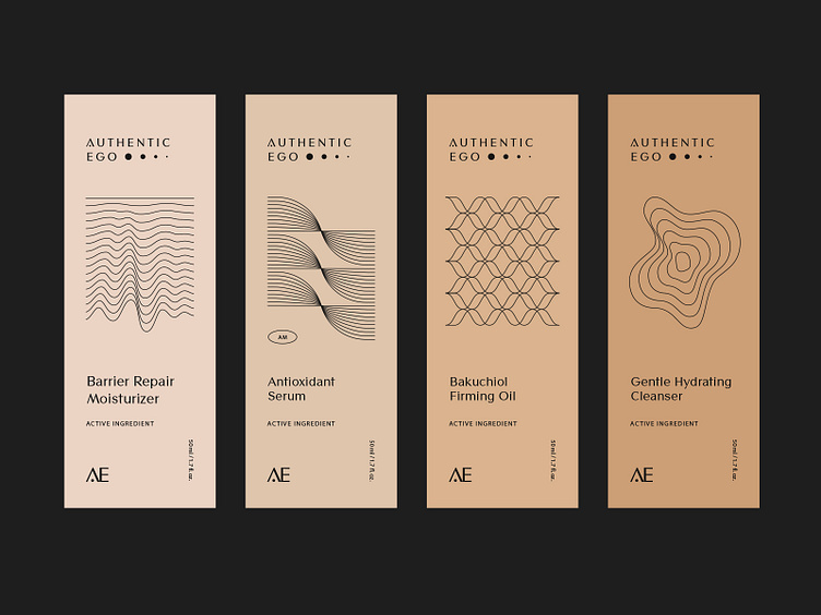
Skincare Packaging Labels
Packaging Labels for Authentic Ego. Their brand values are rooted in science
and self-empowerment. Their brand look & feel is minimal, with a touch of fun.
We chose neutral, tan, and skin tone colors mixed with clean, simple, yet modern typography. To elevate and enhance the overall identity we created a set of abstract, dynamic lines inspired by geometry and science.
The logo represents the AE’s 4-pronged approach to skincare for treating + preventing acne. The 4 dots gradually diminish, similar to how acne spots heal themselves and eventually disappear.
abstract
acne
beauty
branding
clean
contemporary
cosmetics
design
holistic
identity
labels
logo
neutral
nude
packaging
pattern
premium
science
skincare
sustainable
View all tags
Posted on
May 30, 2022
More by Necula Creative View profile
Like


