Cozero visual identity

Visual identity for Cozero — a "carbon action platform" and software that enables companies to efficiently and continuously manage their sustainability transformation and carbon management process in a digital and data-driven way.
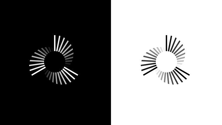
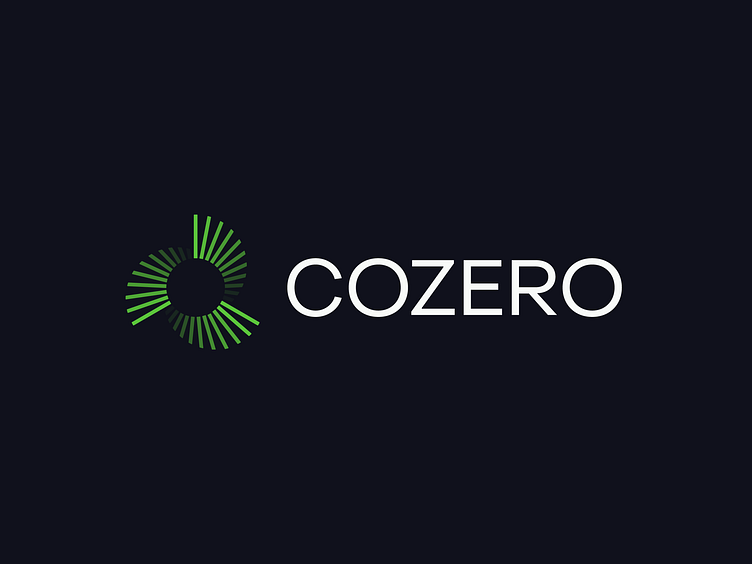
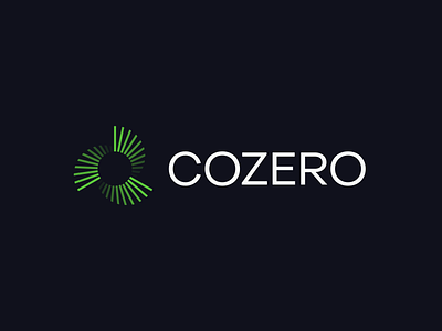
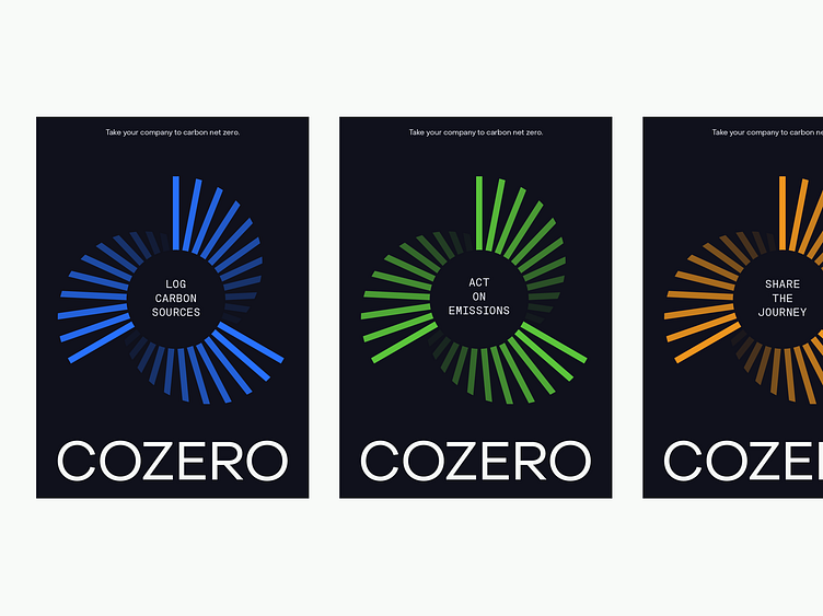
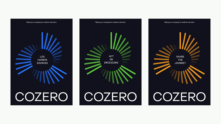
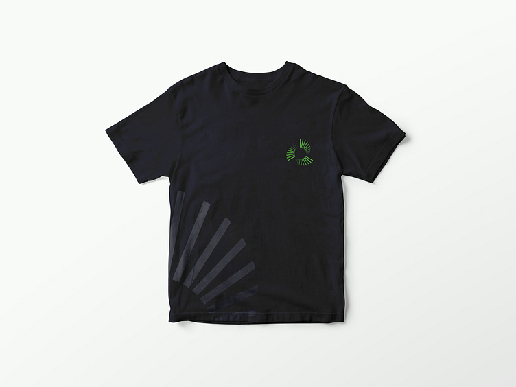
The logo we landed on is a dynamic symbol that gives the impression of a continuous journey, created through diminishing bars. Bars are a nod to analytical and data-driven way in which Cozero operates with carbon management processes. The gradient gives an interesting effect of depth, making the symbol unique while conveying the message of reducing carbon footprint. The center point is an empty circle, hinting at zero and cleanliness achieved after decarbonization.
(website designed by the awesome Ana Moreno)


Website design by Ana Moreno