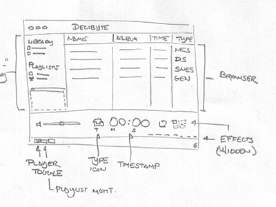
A quick icon for a dedicated NES audio player I was tinkering with a while back. I got as far as a white screen that stepped through the tracks to the original Castlevania NSF file when tapped before thinking about what a pain syncing would be.
From single grilled speaker to a stack of woofers to the diversified arrangement in the final icon.
I was trying to keep the icon to 4 colors but it ended up looking really washed out on the homescreen. The white added the necessary depth to make it feel a little bit more at home on an iOS device while maintaining its distinct aesthetic.
In this case the egg came before the chicken with the icon inspiring the larger illustration (which required the larger, readable logo type) that serves as the background when playing a song.
10 Responses
A quick icon for a dedicated NES audio player I was tinkering with a while back. I got as far as a white screen that stepped through the tracks to the original Castlevania NSF file when tapped before thinking about what a pain syncing would be.
about 3 years ago
Pro
Bryan Veloso
Decibyte library syncing to NoiseES? ;)
*is getting WAYYY ahead of himself...*
about 3 years ago
I can send you the files I was working from for syncing from a desktop server app to the iPhone client ;)
*is also getting WAYYY ahead of himself...*
about 3 years ago
I really don't like the colors (gray) and contrast...
I think it looks weird.
(I don't mean to be rude :)
about 3 years ago
Pro
Dan Rubin
ah, wasn't Dribbble better when it was closed and not everyone could comment? *sigh*
I like it, love how matte it looks.
about 3 years ago
I agree with Michael, I think there is too much contrast in the icon. Just a few tweaks though and it will be finished!
Good luck:)
about 3 years ago
Thanks guys but feedback wasn't solicited. This project was shelved weeks ago, hence the "abandoned" tag.
about 3 years ago
Okay, sorry mate. I didn't understand the context...
@The 2 Dans : Wow. Way to sound like elitist dorks.
I had an account and was dribbling before the site went public.
I don't see why I shouldn't tell Shaun (who's work I usually love) if I believe something is not right in his last pixel-pushing.
about 3 years ago
Pro
Lee Salisbury
"I liiiiike" *borat voice*
almost 3 years ago
Rebound
Evolution of the NoiseES Icon
by Shaun Inman
From single grilled speaker to a stack of woofers to the diversified arrangement in the final icon.
I was trying to keep the icon to 4 colors but it ended up looking really washed out on the homescreen. The white added the necessary depth to make it feel a little bit more at home on an iOS device while maintaining its distinct aesthetic.
In this case the egg came before the chicken with the icon inspiring the larger illustration (which required the larger, readable logo type) that serves as the background when playing a song.
over 2 years ago