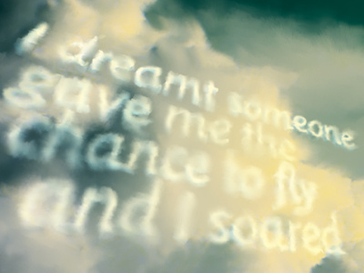
Sky writing detail

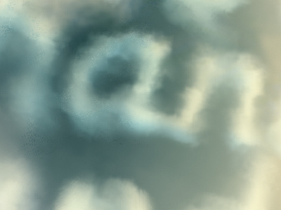
Close up detail revealing that less is more when rendering cloud lettering.
A lesson from the impressionists: take off your glasses, leave only what’s essential to suggest letterforms.
(Then go back and fill in the worst bits if the client insists).
Type derived from Nick Shinn’s Sensibility.