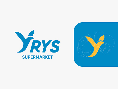
Yrys supermarket | Branding
The main form of the logo is a bird modified by the letter Y. The reason for using this element is that it is equal to the concepts of bird - good fortune, prosperity, abundance, wealth, happiness, and was created to convey the idea.
Let's work together! Contact me at sapargaliabutalip@gmail.com
bird
bird logo
branding
design
flight
graphic design
illustration
logo
logotype
market logo
minimalistic
super logo
supermarket logo
vector
y logo
View all tags
Posted on
May 4, 2022
More by Sapargali Abutalip View profile
Like


