Desktop Email Client - product design

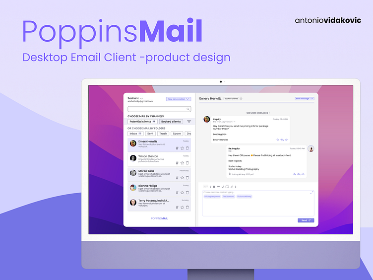
As a part of the Dribbble Product design course, I had the opportunity to work on one of two capstone projects for the course. The idea is to apply all the knowledge we learned through the course and build an design for a desktop email client.
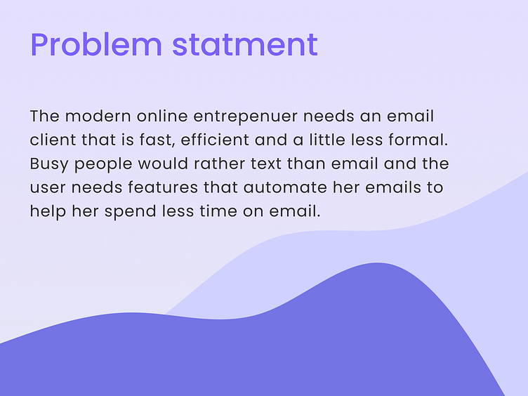
We were given the problem and the research data. My job was to explore common design patterns and flows, find out who our competitors are, and create user flows and wireframes.
Finally, to polish my UI design skills, I also did UI design based on wireframes and tested it on users.
Based on the research result, we were given a user persona.
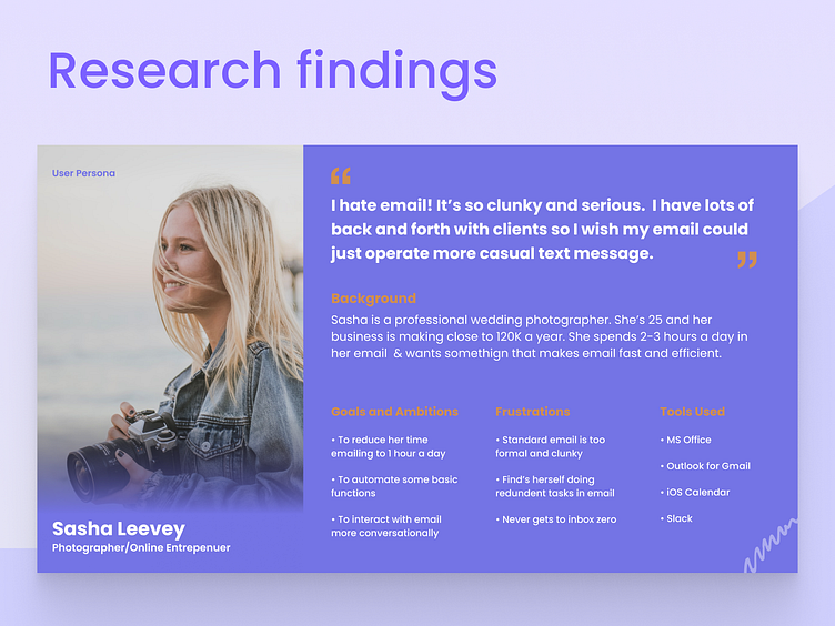
Research
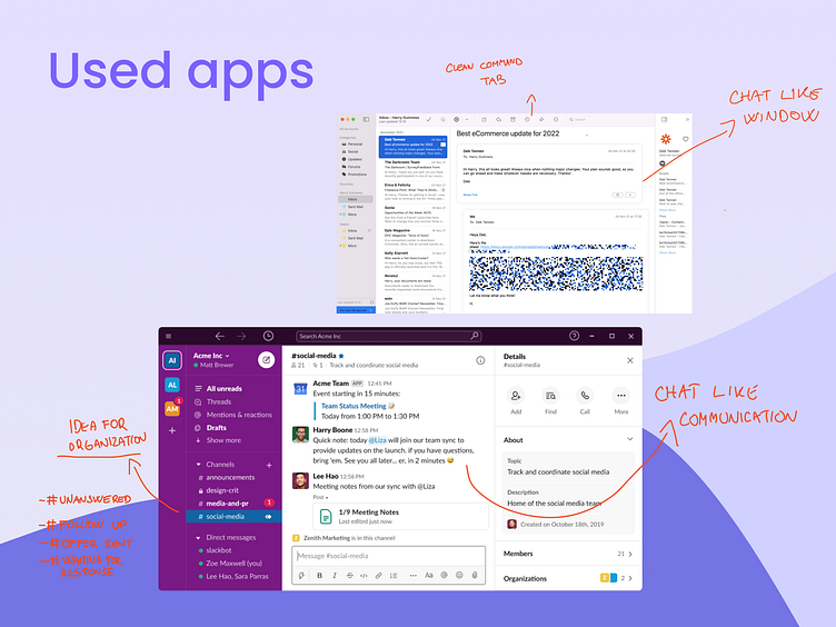
My first task was to find out who our competitors are and explore apps that our user persona mainly uses to find out their most significant pain points, so we bypass them on our way to creating a design.
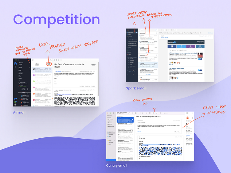
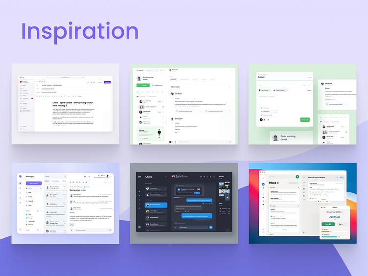
The next step was to find some attractive design solutions and ideas for inspiration. I found most of the examples on Dribbble.
Users flow
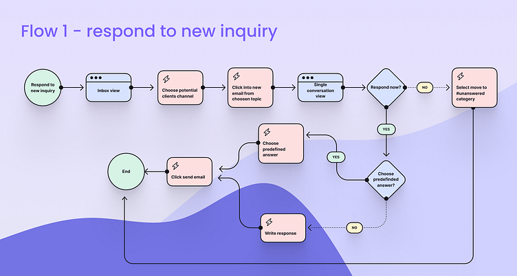
Based on findings from my research phase, I approached designing the main user flow for users - responding to inquiries. I wanted to keep a simple user flow to reduce the time needed to find, filter, and respond to new or existing inquiries.
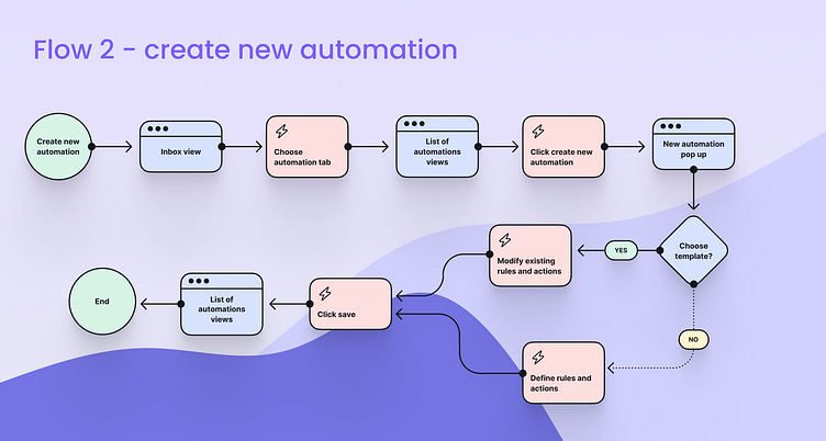
Additionally, I created one more user flow for creating new automation action because that was one of the features most mentioned in our research data.
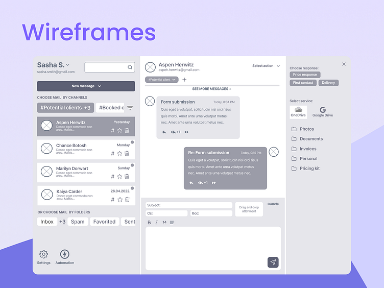
Wireframes
After creating user flows, I decided to develop a wireframe for the first flow because that is, in my opinion, one of the most used flows from a user perspective and a solution to the most significant paint point of the user.
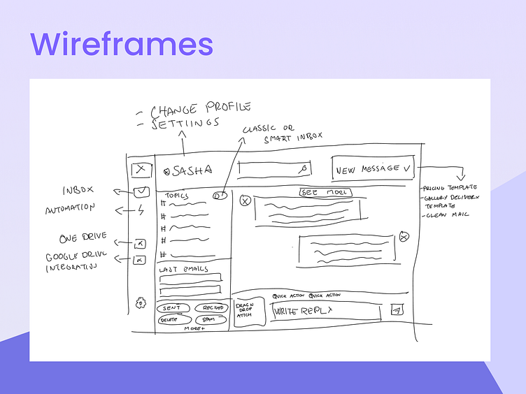
After user testing and feedback, I realized that the user didn't fully understand the functionality of the topics section and how to navigate through different folders and channels; I returned to sketching and came up with these sketches and wireframes.
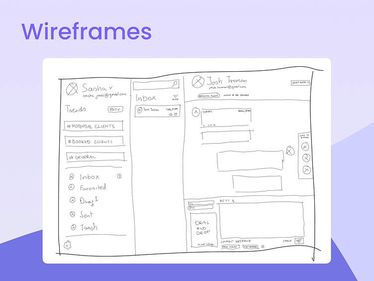
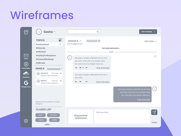
After additional testing and feedback, results indicated that 70% of respondest found 3 column layout confusing because they didn't know where to focus. There were too many sections and options for them to choose from.
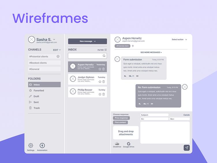
With those findings in mind, I came up with the final wireframe. The respondents said that the 3-column layout was too confusing because they needed to scan the app from one end to another if they were to start reading the conversation and then wanted to change channels.
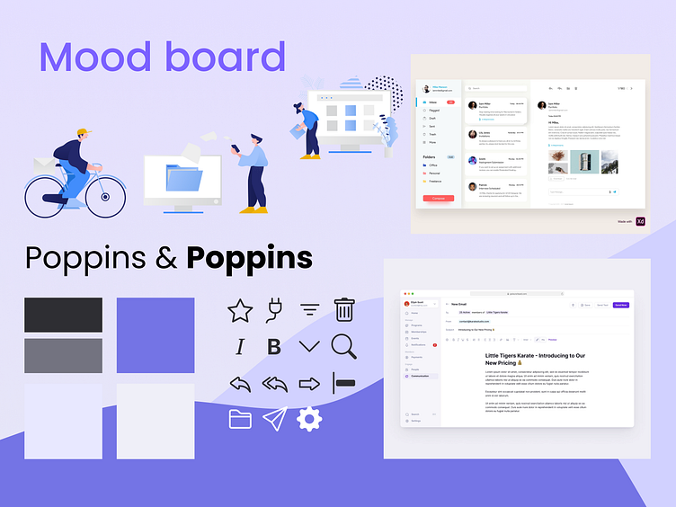
Design
With the wireframe in place, I was ready to unleash my creative side and started with building my mood board. I wanted the app to be clean, modern, and techy.
I liked this purple color, so I chose it as my primary color and created the pallet.
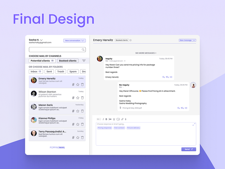
Based on the final wireframe, I approached the designing UI intending to create a modern and trendy look that would correspond with our target demographics to provide a clean and easy-to-use design.
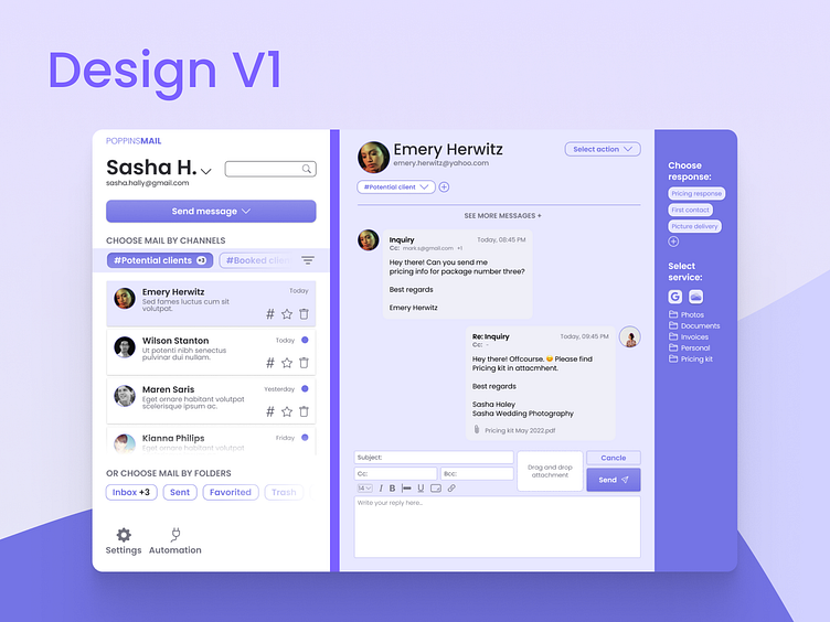
While designing the first version, I didn't feel that magic vibe for the design in general, and I decided to test the app with some photographers on Facebook and Instagram.
Some significant findings were:
The right side stripe was drawing too much attention and, in the end, made users more confused about where to concentrate
Choose response, and Select service section was in the wrong place because they were intended to help users speed up the process of responding to inquiries, and putting them in the top right corner didn't make sense.
Users want to be sure which message channel was selected, and that section with folders section was too small for the relevance level for a user.
I tweaked the design to its final form(at least, I thought it was the final design).
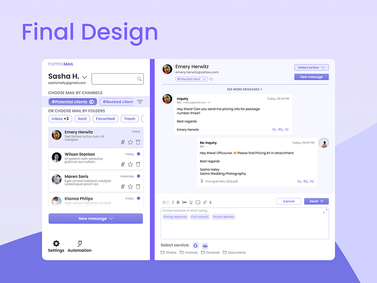
After receiving feedback from my mentor and the rest of the group, which was to simplify design and fix some visual problems:
What is the main call to action button(too many were present)?
Extra options (cancel button, settings, automation, select action) distracted users from using the app to solve their main pain point - answering emails.
So I simplified the design to focus more on direct action (responding to emails). I removed all unnecessary buttons and primary color elements and scaled down some secondary information with that in mind.
What did I learn?
The importance of testing and using received feedback to create a design that will, in the end, help user to achieve their goal and to solve their problem.
Also, one of the most significant findings for me was the ability to solve clutter in design by removing elements until you break the app's primary functionality. With this approach, you can achieve easy-to-use and straightforward design without redesigning whole interfaces.


