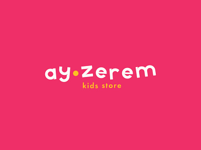
Ay-zerem kids store
We have designed a logo in a modern and minimalistic style. With our logo wanted to show friendliness, quality and trust. The font part of the logo was designed from scratch (you can see it in the “Building” page), and the sign (circle in the center) is made for two purposes.
The first - as a separator of two words. And the second is the association with the moon. At the beginning we wanted make a circle in half, like the moon, but changed their minds because the style did not match.
brand
branding
child
children
design
graphic design
illustration
kids store
logo
market
minimalistic
moon
store
vector
View all tags
Posted on
May 2, 2022
More by Sapargali Abutalip View profile
Like


