Case Study: PetPal

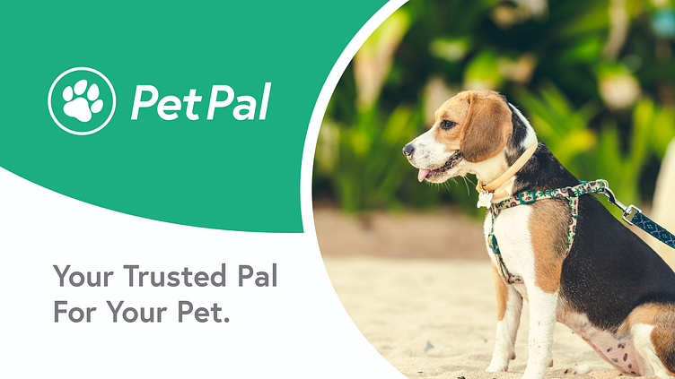
PetPal was created a fictional dog walking app that will help us understand the basic building blocks of product design. This encompasses all of the research to the creation of the prototype.
An owners dilemma
Pet owners have had this situation. They have to go to work at a strange time, go on vacation, or even have a night out to themselves but no friend or family member is able to look after them while they are gone. This sparked the creation of PetPal an app that is intended to help book services such as pet walking, in-house sitting, and even grooming so that the owners can have time to themselves with security and peace in mind.

Scouting the problem
Our group has been assigned to send out surveys to various pet owners. With each member of our group of 17 surveying 3 to 4 people we had a total of 68 results in our survey pool. The results have shown that flexible schedules, vetting processes, and communication are vital to the solution. Our biggest challenge is conveying trust, to be able to trust complete stranger with a very important family member can be frightening so it's understandable that we would need to find ways to show that this service is approachable.
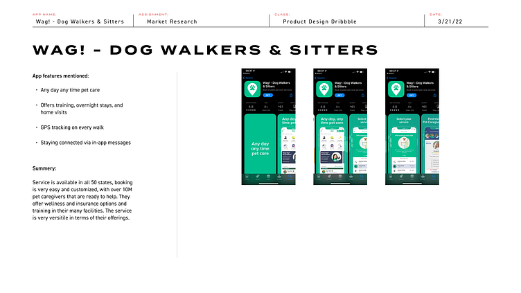
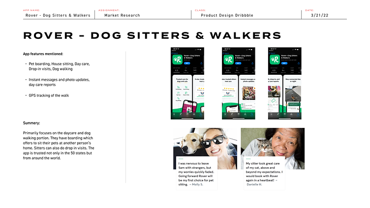
Playing with the big dogs
Competitors such as Wag! and Rover have established ways to showcase security for pet owners. The apps can let owners know how their pets are doing through GPS tracking, frequent pictures and message updates. Both services have national coverage of caregivers that will help look after pets. The biggest part is their review, rating, and vetting system that allows people to evaluate their caregivers.
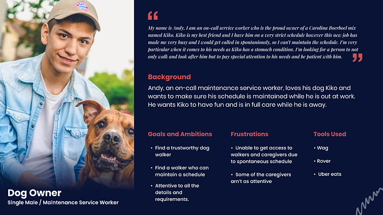
The pet owner
Using our research and data we have created a persona to help encapsulate our primary audience. Our persona will encompass the worker who has irregular hours but cares a lot about his pet. He wants to make sure he maintains his best friend with a condition but when work calls he will have to depend on a service to make sure his pet is okay.
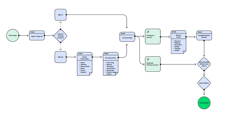
Going with the flow
When working with the competitor apps we noticed that there was a bit of a challenge when accessing the services. To bypass that we thought it would be better to skip the whole process by adding Google, Facebook, and Apple integration which allows for personal information to be prefilled. All they had to do was add in their pet information and select their service. To make things even quicker, duplicating the user's previous service will quickly bypass searching and book with someone they are familiar with especially if you have a consistent schedule.
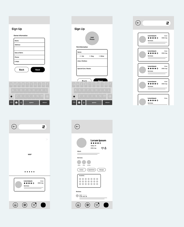
If a dog saw an app
Coming from print design this process of concepting was not something that I was used to, but it was a critical component as it helps me not be too biased to a visual element. There were a couple of changes where I felt didn't really go with the flow or made sense with the process of everything. The first is being the map, the idea came from ride sharing apps, however this instance wouldn't be good for caregivers as they could be subjected to unnecessary tracking. It would be trimmed down to distance markers instead which reduced an extra step.
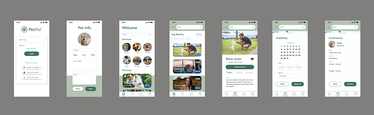
Seeing colors
The part that was most exciting is seeing it come together. The selection of green was intended to be a more inviting and to symbolize the growth of the owners pet. However it was mentioned that the light green selected made the app itself feel a bit dull, it was quickly found that green is quite a difficult color to make contrast.
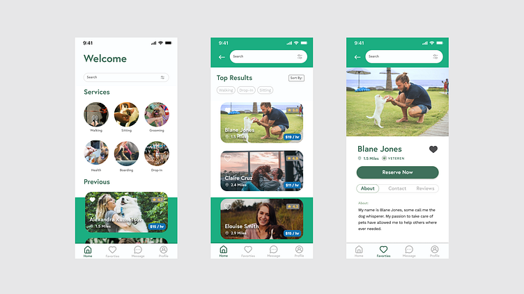
The Prototype
The prototype is born! There were a lot of learning curves that needed to be handled but for the most part it displays the functions that I intended for it to do along with some minor adjustments to the look and feel of it. There are a lot of functions that I didn't get the chance to refine further like creating a pull up motile or side scrolling calendars. As for design wise some of the text ended up being a lot smaller on the phone test so in the future I have a reference as to what font size is acceptable and what isn't.
The treat of learning
As a print designer, my mind is geared to making sure that everything has a hierarchy and flow so that it is visually aesthetic and functional so that the clients message is conveyed towards their audience. In product design this is only a fraction of the equation. The biggest part is the interactive portion, how do we make something that the user can get to their goal in the most painless and efficient way possible. The problem solving, curiosity, refinement and just building something that would be of service to other people are all the things I enjoy doing. I definitely hope to continue learning more within this field.


