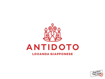
Logo Design for Antidoto
Logo Concept for a Japanese-inspired Bistrot in Milan, that takes pride in its beautiful garden filled with exotic plants and candles.
Antidote, meaning „something that counteracts an unpleasant feeling or situation“, was chosen as the business’ name because it aims to provide an escape from the daily routine to its customers through immersing in a soft atmosphere that provides pleasure to all senses.
The logo features a drop of „magical fluid“, the doorway into a different world, leaves, and candles drawn in a simple, line-art manner, to suggest maturity. Red was chosen as the main color as it, in Japanese culture, symbolizes peace & prosperity, and the simple sans serif font for legibility and a minimal, sophisticated feel.
clean
drinks
enjoy
feminine
flame
flower
food
iconography
italian
japanese
light
lines
milan
minimalism
red
relaxation
restaurant
shapes
sushi
white
View all tags
Posted on
May 9, 2022
More by Coric Design View profile
Like


