


Encouraging checkout button

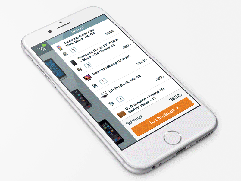
Here is a transition demo in which a checkout cart / basket button gets extra space and attention at the end of a product list.
At the top of the side drawer list, space is needed for displaying the items in the cart, but at the bottom we want to encourage the customer to complete the purchase. This is done by increasing the touch area of the checkout button and placing it within better reach of the thumb.
Enjoy!


