Taste Notes (1)

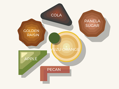
To make the look of the label "different", yet they looks, or tastes the same, I used a same fonts all across the label, and uses, the same shapes, and treatments for all the label. By making the shape looks relatively easy to translate, making a semi-formal composition, my aim was to help the label gets easily read by the customer, and helping them decide what coffee beans might suits their need


