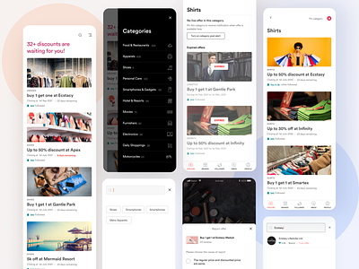
Offkeeper App | Offer explore screens


Last year, we wanted to reduce the information gap between discount offers and interested shoppers who need it the most.
It’s the experience from my university life when I had to be on a very strict budget. I always seek offers so that I can buy my things at a low cost. But often I missed them and feel sad. I was visiting the shop to shop for hours in search of offers. Sometimes there is and sometimes there isn’t. I thought if there any better way to get to know all offers which I search for? But until mid-2019, after becoming a UX designer, I took it seriously how to reduce this information gap?
The Problem Statement / Empathy
Discounts are lucrative. But people who need it the most can’t utilize it because there was no place to find all the discount offers in one place. On the other hand, businesses waste lots of time to sell-out discounted products. So, why do people miss discounts?
We wanted to look for user pain points.
People lack the information about the discount. Which brand is offering it and the expiry date.
The storefront ads and Facebook feeds are the only way to discover discounts. But people don’t observe storefronts habitually, Facebook news feed is already messy.
People may or may not seek discounts all the time. They may prefer discounts on some products and don’t prefer others.
Keeping these pain points in mind, we designed the full app from scratch. You can see the case study and process there.
==
✉️ Have a project idea? I am available for new projects and a full-time remote position. Say me hallo at mafruh.faruqi@gmail.com 🔥
Find me on LinkedIn


