


Hyper63 Iconography

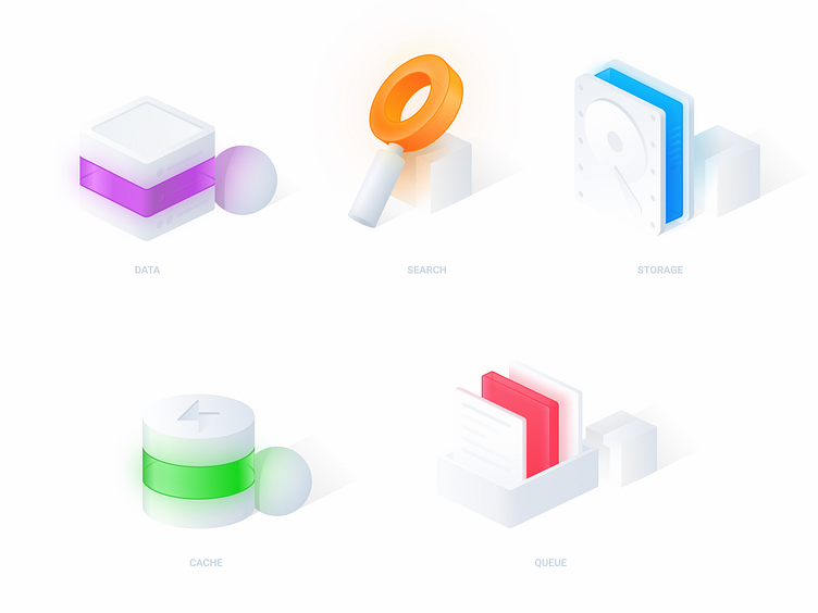
Here is the final design for these 5 icons that were needed for the Hyper63 website. We went with a more subdued "clay 3D" look with a more pronounced neon light effect for the colors.

As you can see here this is the initial sketch for these icons. We already knew that we wanted these bright and vibrant colors to be the stand out feature of each icon. In this case the sketch and the final vector are pretty similar. In some instances this may not be the case as there maybe many iterations to get the the final product.

And lastly here are the icons as they are seen on the final site! We are really happy with the way these turned out the way they bring this site to life with their bright and vibrant colors all the while maintaining a more "clean" look throughout.


