Hyperfantasy: Brand Identity

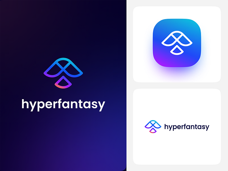
Hyperfantasy is a creative team with various design services, such as UI & UX Design, Illustration, Brand Identity, Graphic Design, Web Development and Mobile Application Development (Project or Product Based).
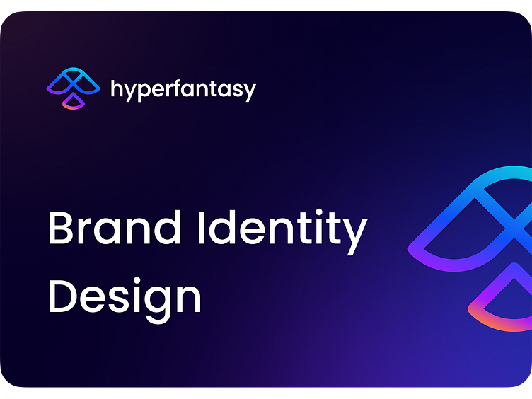
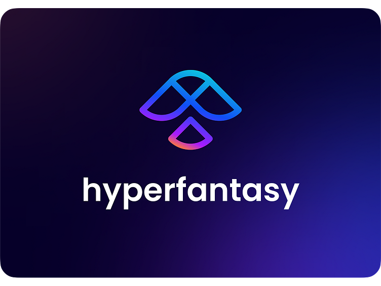
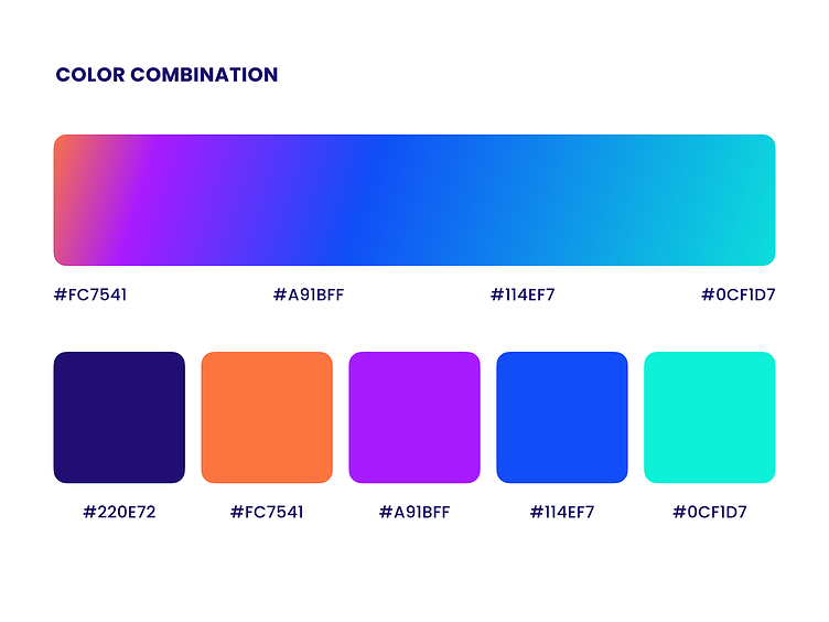
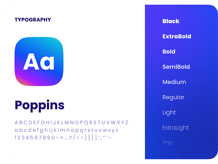
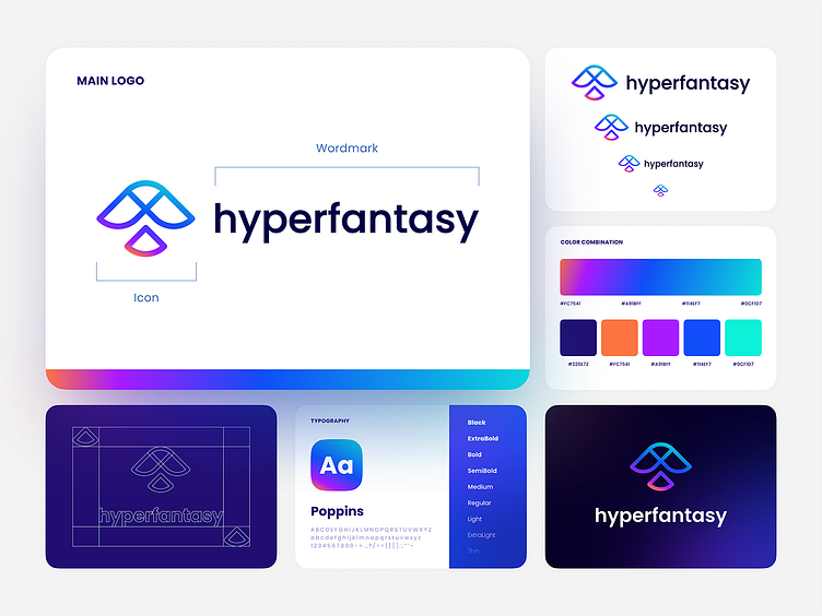
Brand Identity


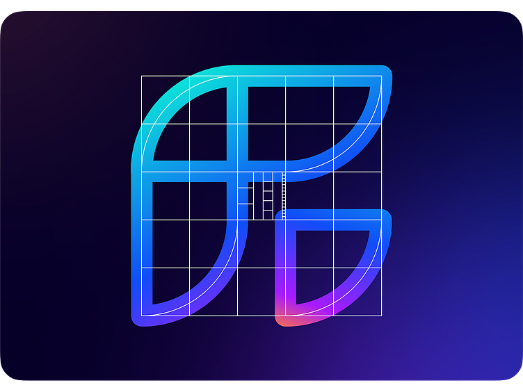
Grid to draw Hyperfantasy's logo
The logo using simple geometric shapes, super simple and easy to draw in grid.
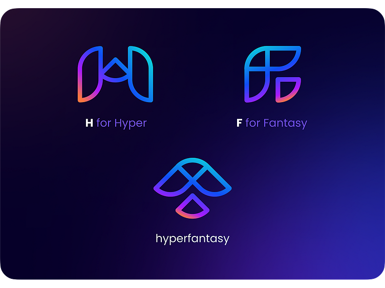
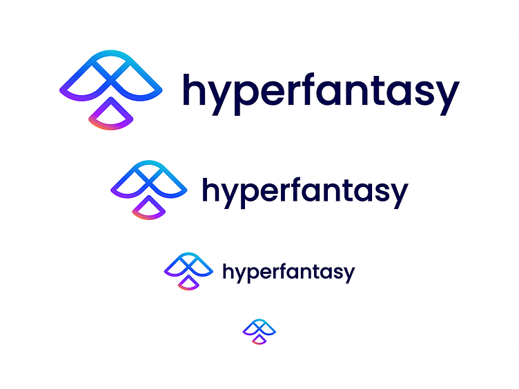
Letter on logo
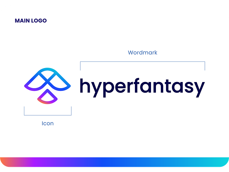
Logomark (logograph) Hyperfantasy consists of 3 main shapes that can be arranged to form the letter H for Hyper and F for Fantasy.
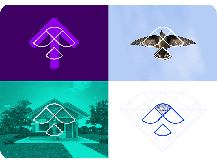
Symbolization on Logo
Although it looks simple, it has several meanings.
Up arrow: A symbol of improvement or enthusiasm to keep trying to be better in skills and service quality
Flying birds: (Main Symbols) Flying birds represent our freedom in creativity
House: A symbol of home, or a place of gathering and sharing happiness, collaborating and working together
Diamond: A symbol of value, we will always try to do the best on every single work
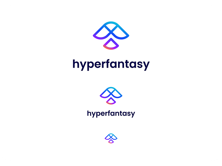
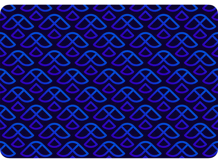
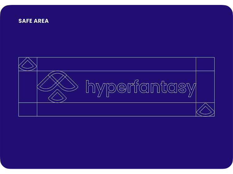
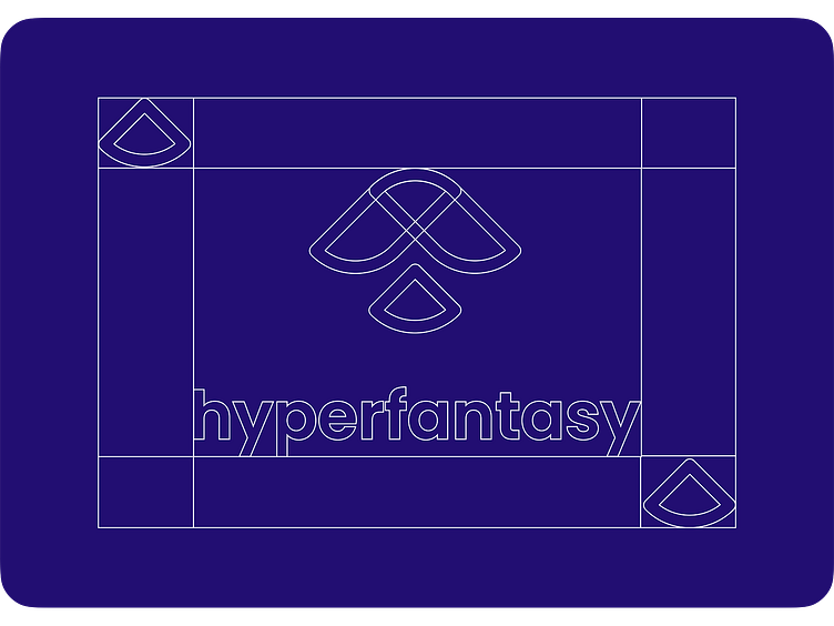
Style Guide
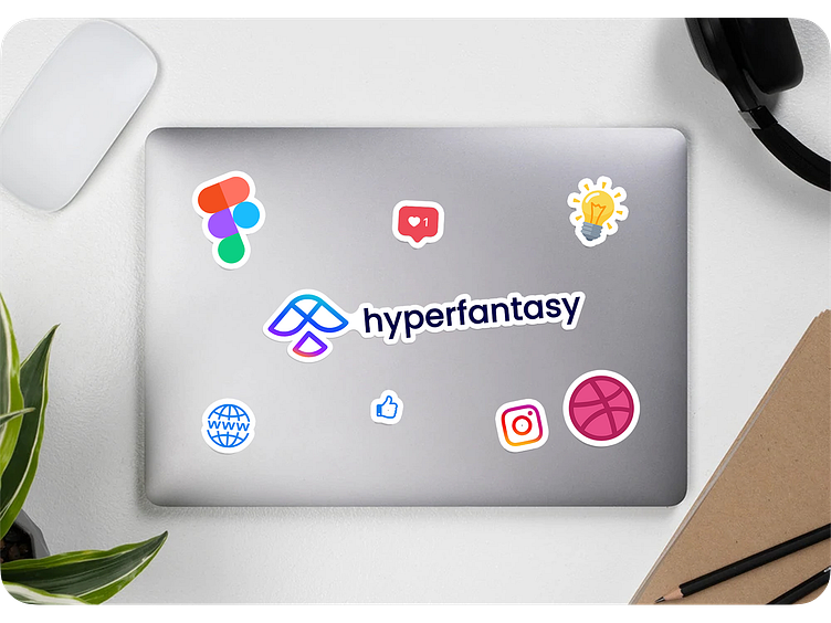
Mockup
Contact Us

Previews

What do you think guys? Let me know in the comments section!
Hope you enjoy it guys. Click “❤️Like” if you like it.
--------------------------------
AVAILABLE FOR NEW PROJECT
🖼️ UI Design | 😄 UX Design | 🎉 Illustration | 🛍 Brand Identity | 📝 Graphic Design | 🌐 Web Development | 📱 Mobile App Development
Design a great experience for your users on the web and mobile platforms with Hyperfantasy. Feel free to mail us: hello.hyperfantasy@gmail.com
Follow us on Instagram!
Thanks !


