Nichole Burnett Photography Logo

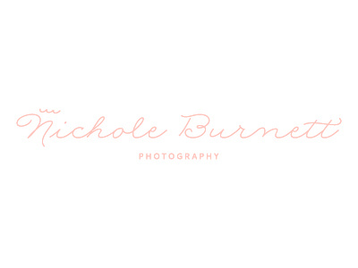

Nichole's logo was designed with a dual purpose in mind—to not only appeal to her children/family market, but also to the occasional whimsical bride as well.
The mark above the "N" was meant to be an abstract representation of both a wave and crown. The wave symbolizes her location—paradise (a la Destin, Florida). The crown is a nod to all things fairytale, which is what inspires and drives Nichole's work.
It was important that the logo utilized a script that was whimsical, playful, and a bit elegant. Since Nichole shoots multiple markets, it needed to appeal to a multitude of personalities!


