New-avatar2

Infographic

Info-2

14 Responses

  1. Pro New-avatar2 Adam Wagner

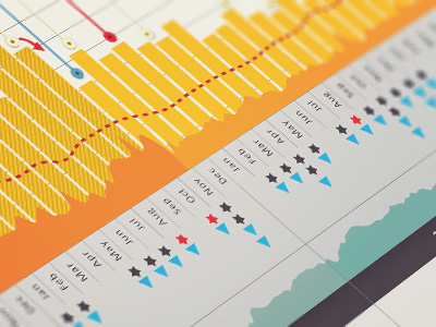
    Here's a not-too-revealing shot of an infographic I did about a year ago showing many facets of data on one timeline.

    likes

    about 1 year ago

  2. Andy Andrew Houle

    Wow! This looks awesome. I'm digging the colors.

    likes

    about 1 year ago

  3. Pro Jeff_breakin Jeff Finley

    You are great at these

    about 1 year ago

  4. Pro Emir-qb Emir Ayouni | Growcase

    Man, that infographic is so slick. Gotta love it.

    about 1 year ago

  5. 544778_275675215847797_100002159633435_581014_223501946_n Herson Rodriguez

    That is awesome @Adam

    about 1 year ago

  6. Twitter_img_sml_new Mike Puglielli

    This is actually really great. I wish we could see the whole thing. Stats never looked so good!

    about 1 year ago

  7. Pro Bsol-icon-dribble14 Todd Zerger

    Sweet. Rich with data but really approachable.

    about 1 year ago

  8. Img_9999_233 Joanne Ong

    lookin awesome Adam!

    12 months ago

  9. Pro New-avatar2 Adam Wagner

    :-) Thanks everybody!

    12 months ago

  10. 20090410_zakiwarfel_25_w Todd Zaki Warfel

    Any way to see the full poster/infographic?

    11 months ago

  11. Pro New-avatar2 Adam Wagner

    Hmm, not really. It has real infos :-) I do wish you could see how the axes are handled though. Given the response to this I might make another in the same style, but with dummy data.

    11 months ago

  12. Pinterest logo Christopher Martin

    I'd love to see the whole thing to understand how useable the graph is for data. Could you post a link? It looks amazing.

    3 months ago

  13. Pro New-avatar2 Adam Wagner

    hey Christopher,
    Ah, no - I'm sorry that I can't show the whole graphic.

    In my 20/20 hindsight opinion, this graphic tried to do too much. There are 3 different vertical axes (revenue, visitors, conversion rate), two time spans of revenue shown at once (monthly and weekly) annotations, icons to represent staff activity during the time period, underlayed traffic charts from other web properties...

    it all got a bit crazy. BUT - it was really fun to make, and I think it did accomplish the job pretty well. If I had to do it again (which I did, for the 2011 annual report), I would aim for simplicity.

    3 months ago

  14. Pro N77100745_30221423_1135square Adam Mann

    @Adam Wagner +1 vote for dummy data. This looks sexy.

    26 days ago

keyboard shortcuts: previous shot next shot L or F like