Find designers
Designer search
Quickly find your next designer
Post a job
The #1 job board for design talent
Inspiration
Courses
UX Diploma
Learn UX design from scratch in 6 months
UI Certificate
12-week UI skill building for designers
Live interactive workshops
with design professionals
Jobs
Go Pro
Log in
Dribbble: the community for graphic design
Log in
Sign up
List View
Bastian Allgeier
Follow
Following
Like
#222221
#F0F1F2
#4D361F
#374B48
#AAA9A8
#5E5C5A
#9B814F
#D1C5AF
Download color palette
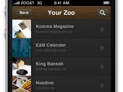
This is the first draft of our upcoming list view for the iPhone app.
app
bookmarks
iphone
list
View all tags
Posted on May 26, 2011
6,098
8
50
4
View feedback
Bastian Allgeier
More by Bastian Allgeier
View profile
Previous
Next
Loading…