Organic Logo Design

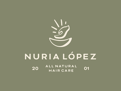
Created this one for a local haircare business who specialise in organic and products and personal treatments. I wanted to represent this idea through the tone of voice of colour, customised typography and also the illustrative element for the brand. The hand and bowl represent care and the physical act of nourishment while the 'rays' coming off of the hand represent the conscious and organic values of the brand.


