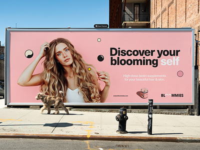
Bloommies

SITUATION
Our client was about to launch a new hair & skin gummy vitamins line.
A brand needed identity, which would help to stand out in the market.
Gummy vitamins have a pleasant taste and are easy to take. Yet they are balanced for adults. However, most of the products, which already existed in this category, looked childish or over the top funny. We wanted a new brand to appear funny & enjoyable, yet in a more solid way.
OUTCOME
The benefits of the product were crystal clear. It makes your hair lush. It makes your skin shine. It makes your beauty bloom. And we decided that the best way to stand out is to let the product itself tell its story.
First of all, we came up with the name BLOOMMIES (bloom + gummy vitamins).
It sounds fun & reveals the product’s functional features. In short, it says: “We are the gummy vitamins that make your hair & beauty bloom”.
Chosen design direction supports the concept. A modern, abstract illustration, which serves as a visual metaphor of blooming beauty, is the main element of the packaging. The light, easy, optimistic colours reflect that vitamins are easy to use, tasty & associated with positive experience.
CREDITS
illustration: Calvin Sprague (Union Haus)
product photography: Aivaras Simonis


