Blendle reader


As navigation in our Blendle reader we decided to scroll horizontally, yes that right. We intended to create an online reading experience that’s closer to print. Of course, the mobile version has a vertical reader. Despite the critical responses we expected at the beginning, since everyone is used to scrolling vertically, people just love it instead!
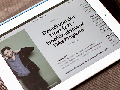
The main image of the article (when available) is shown full screen on the left side of the article. The reader opens with 300 px (of the right side) of the image visible, to make sure you can start reading immediately and increasing usability. When you swipe left you see the rest of the image, when you swipe to the right you see more text.
All content is placed on a baseline-grid with a line-height of 30 px to make sure the content is aligned perfectly at any resolution. That’s pretty cool, however also limits us to change the line-height of the styles. The line-height is locked to 30px, so increasing the font size of the H1 means a relatively smaller line-height.


