The typical reason why you don't really find flat interface elements in iOS or Mac apps is because Apple HIG states that there's a 90° light source shining straight down on all elements, and when a light source hits elements on the screen they should appear realistic, that is, with gradients, edge highlights and shadows that are created from the light source's interaction with the object.
iOS & Mac apps that have interface elements without any shading or highlights whatsoever, in my opinion, are going against the grain of the iOS ecosystem and Apple's HIG.
Well the HIG is just that, a "Guideline" not a writing in stone. Off late I have come across many apps that defy this and are not in the slightest way "not usable enough".
Some being Kickball, CNN app, Flipboard, Flud, Aweditorium, Planetary, Plaintext, ShowYou, Google +, Fontbook ipad, PhotoSynth from Microsoft (and boy it feels so less cluttered).
I think I have personally reached a point where needless noise and gradient will always take a backseat over plain typographically dominant interfaces. Also in cases where these apps are multi platform, flat interfaces are easier for the sake of unified look and feel as well.
Tuhin,
I just came across your shot when looking for flat interface design - for the reasons you stated above. Have you found any other really great examples since you have posted this? I'd be interested to see some.
5 Responses
Pro
Tuhin Kumar
Bringing flat interfaces to iOS.
Have not been able to find lot of examples of this. If you know of some, please add to this question on Quora: http://qr.ae/jMYt
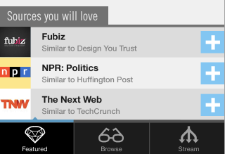
Also try guessing the app.
about 1 year ago
Pro
Mike Rundle
The typical reason why you don't really find flat interface elements in iOS or Mac apps is because Apple HIG states that there's a 90° light source shining straight down on all elements, and when a light source hits elements on the screen they should appear realistic, that is, with gradients, edge highlights and shadows that are created from the light source's interaction with the object.
iOS & Mac apps that have interface elements without any shading or highlights whatsoever, in my opinion, are going against the grain of the iOS ecosystem and Apple's HIG.
10 months ago
Pro
Tuhin Kumar
Well the HIG is just that, a "Guideline" not a writing in stone. Off late I have come across many apps that defy this and are not in the slightest way "not usable enough".
Some being Kickball, CNN app, Flipboard, Flud, Aweditorium, Planetary, Plaintext, ShowYou, Google +, Fontbook ipad, PhotoSynth from Microsoft (and boy it feels so less cluttered).
I think I have personally reached a point where needless noise and gradient will always take a backseat over plain typographically dominant interfaces. Also in cases where these apps are multi platform, flat interfaces are easier for the sake of unified look and feel as well.
10 months ago
Pro
Joshua Taylor
Tuhin,
I just came across your shot when looking for flat interface design - for the reasons you stated above. Have you found any other really great examples since you have posted this? I'd be interested to see some.
8 months ago
Pro
Tuhin Kumar
Not a lot really. Had asked this on Quora, this is what I got: http://www.quora.com/What-are-some-of-the-apps-that-have-a-non-Applesque-look-and-feel-Flat-navigation-bars-Metro-UI-Typography-focused-style-inspired-by-the-Swiss-style?q=flat+ios+interface
8 months ago