Tip

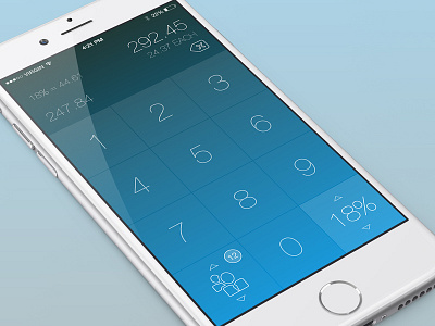

I'm building a simple tip calculator with fun graphics and animations. I'm struggling with the layout of the top portion...
Do the placement of the amounts make sense? It felt more balanced to have the number one punches in along with the delete button below the total amount rather than at the top of the screen, since the distance the thumb has to travel to correct an input mistake would be shorter.
Thanks!


