Proposed redesigns for the Chicommons Website

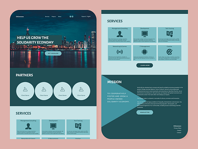


I used existing colors for the teal mockup. I proposed they combine their sites into one site with all the information anyone would need. Their website seemed more about informing their audience about the organization and less about selling their services. I used bold colors in both designs b/c that seems to be common in progressive websites I have seen.


