Zendesk - iPhone - UI/UX/iOS

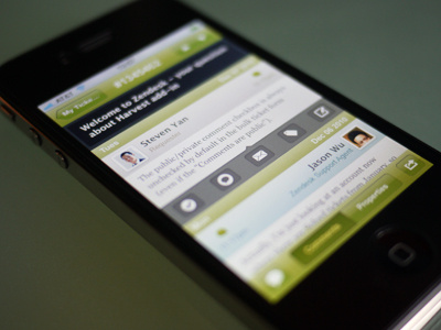

I've been working with the mobile team to improve Zendesk iphone UI. We also added a lot of new features.
What do you think? I would love to hear your feedback.
It's now available on app store: http://bit.ly/9DjNts
I've been working with the mobile team to improve Zendesk iphone UI. We also added a lot of new features.
What do you think? I would love to hear your feedback.
It's now available on app store: http://bit.ly/9DjNts


