Isometric Dropbox Logo

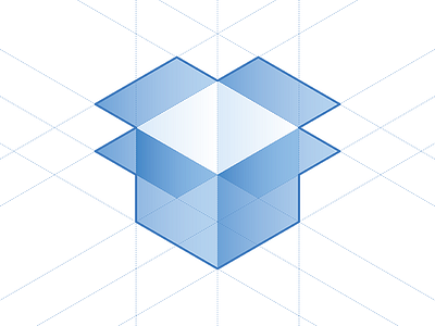
The Dropbox logo has always irritated me with its divergent lines, inconsistent angles, and sloppy projection. This is an isometric projected version of their original design.
Original logo: http://i.imgur.com/m6SoYvr.png
Official branding: https://www.dropbox.com/branding


