Tezos Logo Redesign

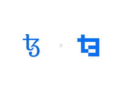


For fun I decided to redesign the Tezos logo. Over the past year I've familiarized myself with the Tezos blockchain and love what it is capable of offering in the NFT space. However, I felt that the logo could use a refresh. This updated version was built out of blocks (blockchain) from a pixel grid. My goal from this exercise was to keep the existing t3 direction (which represents third-generation blockchain) but modernize the design and make it appear stable and stronger.
I'm available for more logo design and brand work. Let's work together!


