4k pub logo

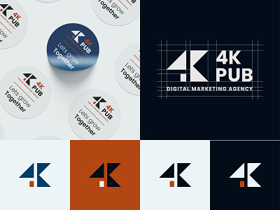
Here is more of the logo i made for 4k pub and how it works on different colors, as well as the construction of the logo.
4k pub is a digital marketing agency with passion to grow businesses online and on social media through creative marketing and design.
The logo is an abstract form of the initial two letters of the name, constructed from triangles and a rectangle to give it a geometric and professional look.
for a more in-depth look at the whole project and the process behind, check it out on Behnace


