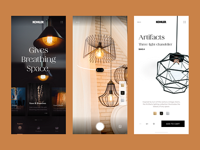
Kohler app concept UI


Hello Dribbblers 👋
I was wandering if I can give the Kohler brand a new skin design. Here is the progress I made today. I tired to keep it content-light while maintain it's brand elegance. You can observe best how much I conveyed my desire.
--
I like to learn user psychology and behavioral science. So, I share in every shot as "ShotNote" about what I think about specific issue. Please correct me If I am wrong, or suggest me what I should know or read!
--
ShotNote 3: Fitts’ Law and UI button/CTA placement.
According to the Fitts’ law: “The time required to click on desired target is the function of the ratio between the distance to the target and the size of the target.”
*T (Time) = a + b log2 (2 D (Distance)/ W (Width)*
Now, what does it even mean? It took time for me to understand this law. In easy language, in an interface, the time a user take to click or tap a button related to the buttons relative position on the interface and the size of it.
For example, in a mobile interface and, assume that our user is right handy. If we place CTA button at the top-left corner, it will take more time for user to click, versus, if we place it at the bottom-right corner. which will take the minimum amount of time.
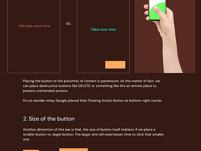
1. Placement of the button
Placing the button at the close proximity of context is paramount. As the matter of fact, we can place destructive buttons like DELETE or something like this at remote place to prevent unintended actions.
It’s no wonder whay Google placed their Floating Action Button at
bottom-right corner.
2. Size of the button
Another dimention of this law is that, the size of button itself matters. If we place a smaller button vs. larget button. The larger one will need lesser time to click that smaller one.
3. Color of the button.
Color of the button matters too in Fitts’ law. If the CTA color is stand-out and consistant, it will take lesser time to interact with versus not-so-much distingushable buttons or buttons that blended with background.
May be for this reason, Apple’s native CTA button color and. links is BLUE all around their website and other text AREN’T blue. Is it consciously chosen?
*Details illustrations attached in the shot *
*For any suggestion of correction, please mention me in shot comments! *
--
Hello 👋 I am Mafruhur Rahman, an UX designer and App Developer experience on making design systems, mobile apps, futuristic experiences.
Currently open for projects & remote positions.
Say me hi at mafruh.faruqi@outlook.com
or Skype at live:mafruh.faruqi
Peace! ✌️


