Find designers
Designer search
Quickly find your next designer
Post a job
The #1 job board for design talent
Inspiration
Courses
UX Diploma
Learn UX design from scratch in 6 months
UI Certificate
12-week UI skill building for designers
Live interactive workshops
with design professionals
Jobs
Go Pro
Log in
Dribbble: the community for graphic design
Log in
Sign up
Woopm - Index - V2
kailoon
Available for work
Follow
Following
Like
Get in touch
#263B4C
#EEEFEA
#14171A
#A9AAA5
#596062
#9EBE5F
#728E50
Download color palette
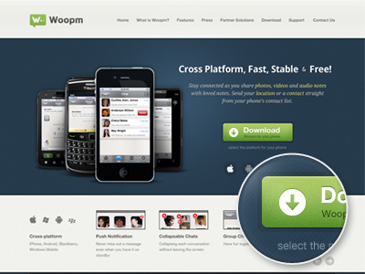
Version 2 based on client's feedback.
Rebound of
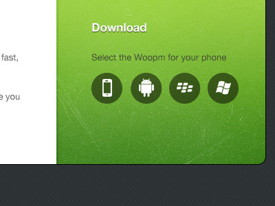
Download II
By
kailoon
android
button
cross platform
download
droid sans
helvetica neue
home page
ios
iphone
mobile
windows mobile
View all tags
Posted on May 19, 2011
10,240
22
195
8
View feedback
kailoon
Get in touch
More by kailoon
View profile
Previous
Next
Loading…
Loading…
Loading…