SCRP Conf 2021 logo&branding

The challenge:
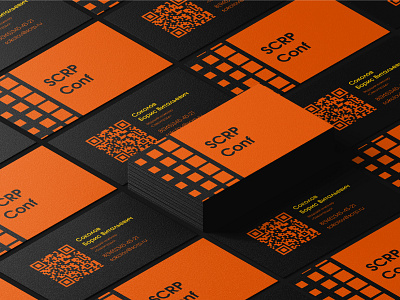
The task was to develop a logo and identity for the SCRP Conf. The "Sevsipruda" company (organizer of the conference) specializes in the preparation of ferrous and non-ferrous scrap and its delivery to the largest metallurgical enterprises.The conference takes place in the fall. Target audience: men 27-40 years old, managers and specialists of companies in the scrap metal industry, purchasing managers, production management and chief engineers, income is different.
The solution:
Minimalistic logo with clear shapes and sans-serif geometric font. The logo combines associations with a conference hall, shredding, pressed scrap blocks. The color scheme is inspired by molten metal, also associated with autumn.
Full case you can explore on my Behance! Feel free to appreciate and comment!
Contact me for discuss your project on Telegram
Or mail me alyona.ivanushkina@gmail.com


