Amnis Brand Pattern

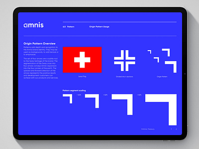
Amnis is an electronic foreign exchange and international payment solution designed for SMEs. The reason behind their desire to rebrand was to connect with a new global audience that conquers new markets with an identity that mirrored their new services. The pattern consisting of four arrows are a nod to Amnis’ Swiss heritage. The segmentation of the Swiss cross into four arrows conveys the expansion into the four corners of the earth. The upward and forward direction of the arrows represents the positive results and development customers can achieve. The secondary, low-contrast geometric pattern evokes automation and intuitive systems that are always working behind the scenes. The individual elements inside the pattern showcases the currency exchange process and financial and professional growth.
Work enquiries
Available for new projects. Email me directly at info@jddesigns.co.uk
Let's connect
jddesigns.co.uk


