The Green Dot: case study

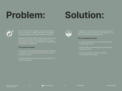
Redesigning The Green Dot was a problem solving process: fixing the scalability of the logo, make its meaning clearer, and keeping its versatility.
Redesigning The Green Dot was a problem solving process: fixing the scalability of the logo, make its meaning clearer, and keeping its versatility.


