Treadaway Co. T Icon

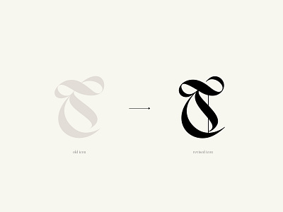
This expressive blackletter T was created in partnership with Catherine Treadaway. Catherine came to me with a fabulous concept, but knew the T just was not quite right. I focused on smoothing curves, adding balance, and toning the letterform to create a truly unique and customized mark for Treadaway Co. an independent brand studio specializing in brand strategy work.


