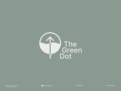
The Green Dot symbol redesign
Since 1990, The Green Dot is a very misunderstood symbol, resulting in huge amounts of recycling contamination (due to its resemblance to the recyclable symbol). I redesigned The Green Dot (in contribution to the campaign held by Two°Creative × The Brand Identity) to make the symbol easily understandable and fixing some of its major design flaws by the way.
brand
brand design
brand identity
branding
case study
design
europe
graphic design
icon
icon design
logo
logo design
logotype
portfolio
project
recycle
recycling
symbol
the brand identity
the green dot
View all tags
Posted on
Jan 7, 2022
More by glypse View profile
Like


