Animated Apple Watch Radial Bar Chart

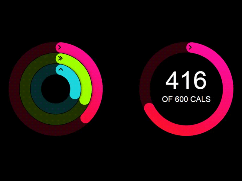
Rendered with d3.js (hint: it's a screen record, so it's not perfect loop), check out the full source code at: http://codepen.io/xna2/full/Dmqso/
What do you think of apple's design of this? Will radial bar chart (with rounded corners) be a new trend in data visualization?


