PP Barbers — Mobile Landing

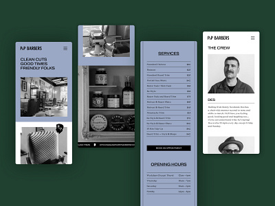
Long before the barbershop craze, there was Pickings & Parry on Gertrude Street, Melbourne. We created the branding for the shop back then — it wasn’t too dissimilar from the rest of the P+P identity of the time: traditional, classic, and yellow. This is the evolution of P+P Barbers. A new identity system for the icon it has become. We looked at this as a straightforward modernisation with the brand's heritage in mind. No fussy bits ‘n pieces, just simple typography and a unique colour palette.
View the live website here
View the case study here
Atollon is a powerful creative resource. With a direct synergy between brand and web, we exist to help organisations be their best selves; conceiving and solving design problems with a passionate concern for detail.


