Find designers
Designer search
Quickly find your next designer
Post a job
The #1 job board for design talent
Inspiration
Courses
UX Diploma
Learn UX design from scratch in 6 months
UI Certificate
12-week UI skill building for designers
Live interactive workshops
with design professionals
Jobs
Go Pro
Log in
Dribbble: the community for graphic design
Advance your career with a Professional Diploma in UX Design
Learn more
Log in
Sign up
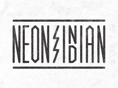
Neon Indian
Jimmy Walker
Follow
Following
Like
#F9F9F9
#373334
#C1BFC0
#9D9B9C
#817E7F
Download color palette
Love these guys.
band
logo
type
View all tags
Posted on May 14, 2011
2,928
14
100
11
View feedback
Jimmy Walker
Design Director based in California 🤘
More by Jimmy Walker
View profile
Previous
Next
Loading…