Radial chart for complex data


Hello, everyone 👋!
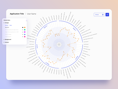
Take a look at this beauty 🤩! It tells all that what visualizations are. They are one of the best methods for understanding raw data and drawing conclusions from it 😊. Such visualization allows you to find 👀 patterns and trends that might not be noticed without a visual context. Thanks to the additional filtering option, you can analyze large data sets tailored to your needs. And it looks just awesome 💗!
------
We're available for new projects! Just drop us a line at office@synergycodes.com


