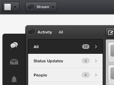
So it's been awhile since my last post, but today I was inclined to share with you one of the recent developments on Rule.fm -- the Stream redesign.
As a designer with some experience, I've discovered that humility is something found wanting in our space and I can assure you the Rule.fm project set a box of humility on my door step every day since the start. Was it something that I welcomed? Sure, but that being said with a grain of salt. But after having gone through these painful and humbling processes, I think it's safe to say that they have shaped me into a "designer" (of whom solves problems; save the pretention) versus one who pushes pixels around the screen, banking on the fact that the aesthetics will make everything else go away.
This comp is "lited", which is to say that it is grayscale & bears minimal layer styling; I find handling design in such a way frees me from getting caught up in the aesthetics, thus my attention is wholly dedicated to solving problems.
There may be a few areas that are unclear in this comp (and don't mind the redundant icon use and poor icon quality), but I welcome questions of any sort for those of whom need clarification.
@Drew_Wilson Haha! Yes, I found the avatar-only account drop-down pretty clever seeing as how it's contained versus having to design around an arbitrary character amount.
6 Responses
Pro
Dalton Woods
Full-version is attached.
So it's been awhile since my last post, but today I was inclined to share with you one of the recent developments on Rule.fm -- the Stream redesign.
As a designer with some experience, I've discovered that humility is something found wanting in our space and I can assure you the Rule.fm project set a box of humility on my door step every day since the start. Was it something that I welcomed? Sure, but that being said with a grain of salt. But after having gone through these painful and humbling processes, I think it's safe to say that they have shaped me into a "designer" (of whom solves problems; save the pretention) versus one who pushes pixels around the screen, banking on the fact that the aesthetics will make everything else go away.
This comp is "lited", which is to say that it is grayscale & bears minimal layer styling; I find handling design in such a way frees me from getting caught up in the aesthetics, thus my attention is wholly dedicated to solving problems.
There may be a few areas that are unclear in this comp (and don't mind the redundant icon use and poor icon quality), but I welcome questions of any sort for those of whom need clarification.
about 1 year ago
Pro
Dave Hornsby
Looks good to me - nice and clean and clear :)
about 1 year ago
Pro
Muhammad El Melegy
Great job, Well done sir!
about 1 year ago
Pro
Drew Wilson
Looking great bro!
Inspired by Dialoggs = +500 points!!
about 1 year ago
Pro
Dalton Woods
@Drew_Wilson Haha! Yes, I found the avatar-only account drop-down pretty clever seeing as how it's contained versus having to design around an arbitrary character amount.
Hope the Dialoggs project is going well for you.
about 1 year ago
Pro
Mani
nice :)
5 months ago