Moose

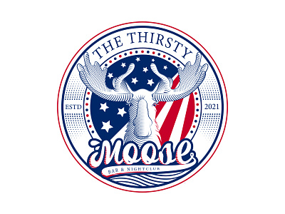
The logo was originally designed for Bar and Night Club.
The concept of the logo has been somewhat abstract for the convenience of design.
If you have time, you can read to get the idea of the concept.
The client's The Thirsty Moose logo has been used as a red and blue light in the middle to give it a nightclub feel. The American flag on the back is the client's choice, so use it.
The flag is designed in such a way that the feeling of night and spotlight comes at the same time.
They have been given the feel of night and nightclubs.
The red spots on the other side of the flag are meant to be spotlights. But the whole American flag can be understood in general.
Moose is taken seriously to mean Thirsty, and with a drop of water in the middle of the letter and a ripple of water below, it means that Moose is standing on the water.
If you love my work, you can follow me for see first my latest shot. your like and comment always inspire me doing great job.
I am always ready to satisfy my client. I hope you like my design. If you need any such design then you can message me anytime. I am waiting for you.
Thank You.


