Find designers
Designer search
Quickly find your next designer
Post a job
The #1 job board for design talent
Inspiration
Courses
UX Diploma
Learn UX design from scratch in 6 months
UI Certificate
12-week UI skill building for designers
Live interactive workshops
with design professionals
Jobs
Go Pro
Log in
Dribbble: the community for graphic design
Log in
Sign up
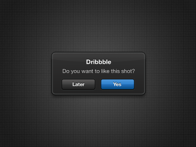
iOS Notification Redesigned
Daniel Paul
Available for work
Follow
Following
Like
Get in touch
#2B2B2B
#464646
#408CD3
#155C9E
#9E9E9E
#E5E6E6
#173C5E
#9AB8D4
Download color palette
A redesigned dark version of iOS notification box...
black
blue
dark
dribbble
ios
ipad
iphone
ipod
notification
View all tags
Posted on May 11, 2011
4,676
6
99
11
View feedback
Daniel Paul
Get in touch
More by Daniel Paul
View profile
Previous
Next
Loading…
Loading…
Loading…