EAST Partnership Login Screen

EAST Partnership, explored a little further.
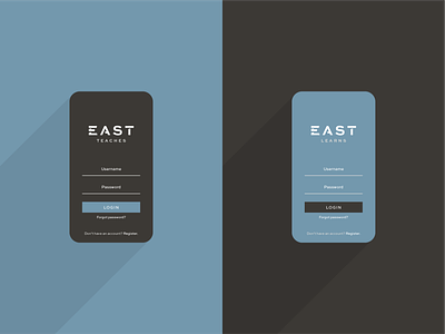
Here's how the brand's design might look in the context of a login screen for our coaches and students. Color plays a particularly important role to one, distinguish the login portal between coaches (dark) & students (blue), and two, highlight touchable/actionable items (white).


