CSS3 buttons

Disclaimer: The design of the buttons is not mine. The CSS3 implementation of the Photoshop mockup is.
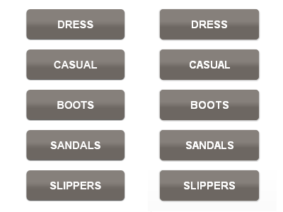
The original from Photoshop on the left, the CSS3 interpretation of them on the right.
Linear-gradient, box-shadow, and border-radius. Good stuff!
The basic code (assume all proper vendor extensions):
.col ul a {
background-image: -moz-linear-gradient(top, #86807b 20%, #86807b, #6d6762 60%, #6d6762); /* FF3.6 */
border-radius: 5px;
box-shadow: 1px 1px 1px #c4c4c4, -1px 0 1px #c4c4c4;
color: #fff;
display: block;
font-size: 15px;
font-weight: bold;
height: 30px; /* 43 */
margin: 0 0 14px 0;
padding: 13px 0 0 0;
text-align: center;
text-decoration: none;
text-transform: uppercase;
width: 140px;
}


