Rochaldas Sons | Branding
Our branding work for Rochaldas Sons
About
Rochaldas Sons has made a name for itself in the list of top garment suppliers in India. The company is located in Nagpur, Maharashtra and is one of the leading sellers of mens wear clothing.
Brief
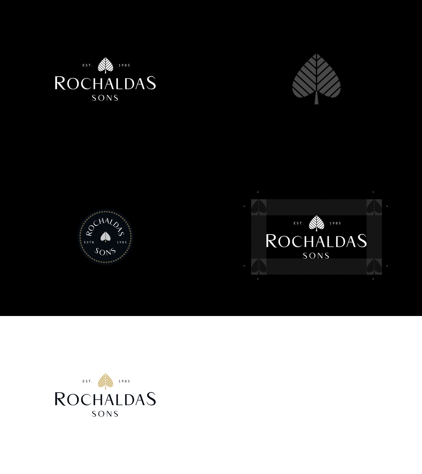
The target was to build a logo that reflects the legacy of the brand - Rochaldas Sons. Based on the list of key words selected during design research(professionalism, classical, established, exclusive, masculine, sophistication, and traditional), we defined the brand personality through the means of the logo.
Identity
The spade symbolizes wisdom, acceptance and labor. The cordate leaf shape has 2 sharp corners and 2 curved lines, which is again a representation of the masculine-feminine blend.From another perspective, it can be seen as a tree with lots of branches that signify legacy and heritage.
----
Looking for someone to take your brand to the next step?


