Santa's Beard Oil
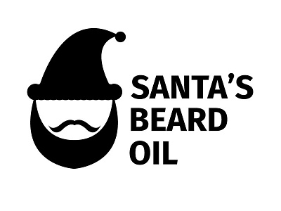
I'm designing a logo for beard oil focused on, and marketed at, Santa's. I've researched quite a bit of beard oils and they all seem to have a feeling of grounded, strong, masculinity. This doesn't traditionally favor the jolly Old Saint Nick, so I thought, "Why can't it?" I have a face and photograph of the proprietor, where I got the mustache and beard shape from, but wanted to keep it relatively simple and iconic. There are so many varieties of Santa's, I didn't want to associate with one particular one.
The typography is Fira Sans from Erik Speikermann for Mozilla. The stability and adaptability is present, and the accessibility bit of the web. The open source-ness is something I thought of while choosing the type because, well, the concept and idea of Santa is just that.


