


Logo Themeist Theme Shop
This is a Work in Progress for Themeist.co a WordPress & Ghost Theme shop.
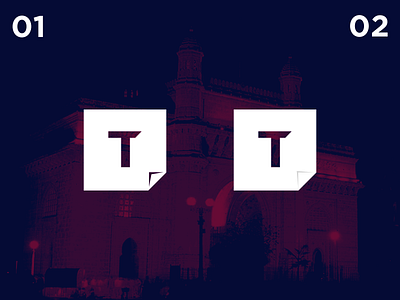
Some ideas used in the logo:
- Simple & clean to reflect my work (themes)
- The "T" is shaped unevenly to denote a "Hammer". To convey the products as a tool.
- The corner fold is to denote a sticker. Themes should be easy to apply and remove as a sticker. So wanted to somehow convey that in a logo.
In the 2 logos, there is only 1 minor change in the cover fold. Would appreciate if someone could provide feedback.


