Visually Showing Responsive Design for new Solid Homepage

When we were planning out the user experience for the new Solid website, we really wanted to do something different with the homepage that was unique and didn't feel like emulation of other agencies that we look up to (hat tip to @Teehan+Lax and @Happy Cog ).
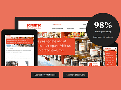
We wanted the introduction to relate directly with our clients. Not just say, "Hi we're solid, we do stuff." But say, "Hi we're solid, we do stuff for cool companies like this."
That led to building a transition on the homepage between different clients and added a fun level of interactivity. The final cherry on the top was the option to add in a statistic to show results.
I personally think it looks even better on tablet/portrait view.
Would love to know your thoughts. Check out the finished version at http://asolidsite.com/


