Foodspotting 2.0

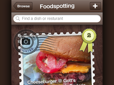
I loved Foodspotting but hated the iPhone app. So, I mocked up a new one and sent it to the developers.
View the full size comparison
I loved Foodspotting but hated the iPhone app. So, I mocked up a new one and sent it to the developers.
View the full size comparison


