Rift - Logo

First of all, I need to say that I am not a professional logo designer. I love doing typographic logos, but you can tell me are they any good! (I will post more in the next few days) 🔥
I usually take logo jobs as an addition to the app or website. Since I'm doing art and creative direction I can naturally feel the best logo for it.
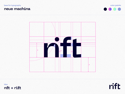
The name 'Rift' came from a connection with Nft, so it was the logical thing to connect these two things. I was experimenting with fonts and saw beautiful ink bleeds with Neue Machina. I also noticed that if you cut the small letter 'n' you will get 'r' and 'i'. At first, I was making a full cut, but then I realized why shouldn't I take ink bleeds to my advantage. This made the logo less readable but more interesting for the eye. Then I also tweaked kerning and shapes of the letters to be more geometrically correct. What you see is the result.
Let me know what you think! 🙌


