SoBe Energy Logo Redesign

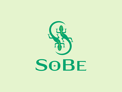


SoBe was always one of my favorite energy drinks growing up, so I thought it would be fun to redesign their logo! I wanted to clean up their lizard mascot and update their typography a bit to bring it into this era.
I took more of a geometric approach to designing the lizards and made them more iconic and less illustrative. The old lizards formed an "S" out of the negative space in between them, but it is pretty subtle and not very clear. Making them geometric allowed me to make the "S" more identifiable. I was able to create a cool pattern out of the lizards (see the last slide)!
For the typeface, I also got rid of some of the serifs on the type and went with a slightly bolder typeface. This helped get rid of that "stretched" look that the older typeface had, and made the brand feel more confident.
Lastly, I updated their brand colors a bit to make them more vibrant and got rid of the black stroke around everything. Swipe to see the before and after! Let me know what you think!


